Landing pages are the second part of the PPC puzzle. No matter how good your campaigns are, you’re never going to convert if your landing page isn’t up to scratch. In fact, 68% of B2B businesses use strategic landing pages to acquire leads.
Unfortunately, you can’t just copy someone else’s, no matter how great it is. The quickest and easiest way to create a successful landing page is by doing some industry research and scanning the market to find the best techniques that will work for you.
If you haven’t got an eye for detail, we’re here to share 15 of our favourites.
1. Balance Meals
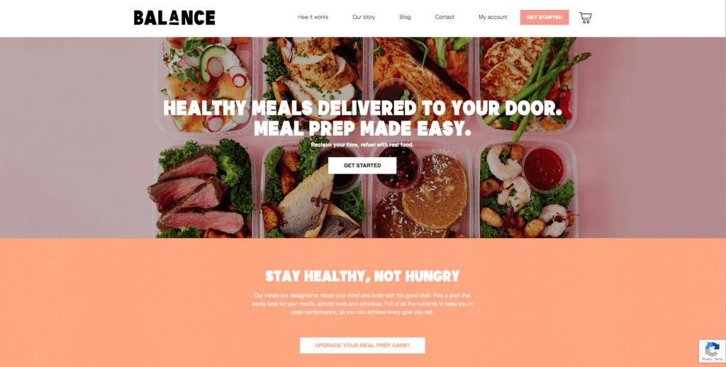
The bold headline and featured image here are some of the best. The headline is benefit-driven and instantly ticks off three deal-breakers, which is perfect considering 80% of people only read the headline. Examples of their delicious meals shine through the headline and showcase the variety of meals they cater to, creating both excitement and intrigue. It’s a win-win.
The two CTA’s above the fold prompt the user to take action straight away, with a white background that makes them stand out on the artistic page. If you scroll down, three popular meal plans are explained and broken down into a brief description, contents and price, so visitors know exactly what to expect.
Excellent Trustpilot reviews, information about recycling and details about their cultural influence are found below – all which add extreme credibility.
2. My Tutor
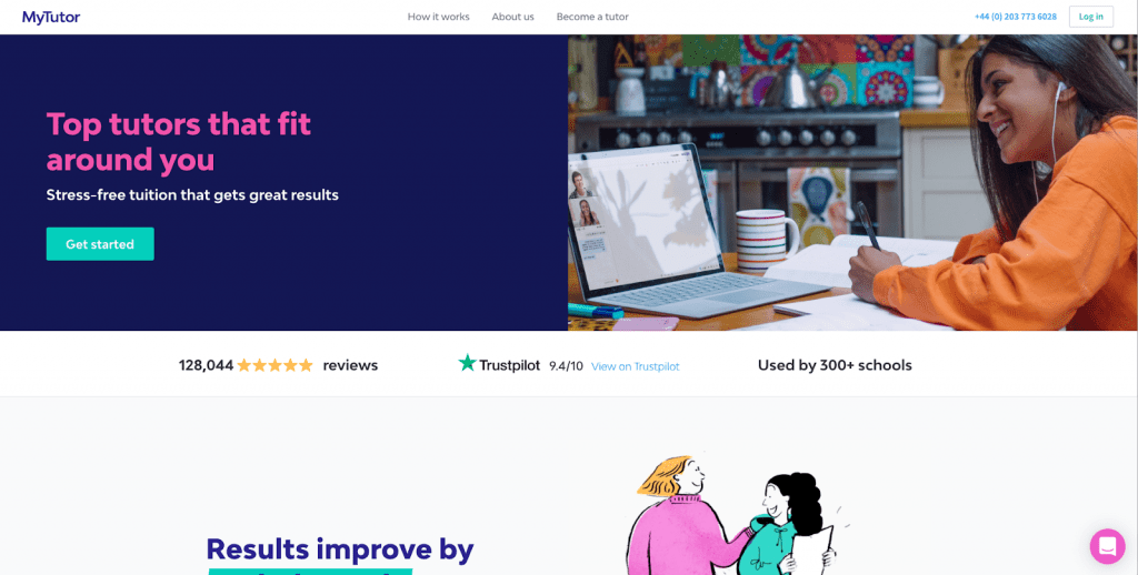
This has seven benefits above the fold. And the design is both simple and appealing. Amazing.
The first subhead assures users they can improve results by a whole grade, with tangible and measurable results from past customers. The following sections are just as benefit-driven, with details about flexibility, freedom and helping children of all abilities reach their full potential. Which is what every parent wants to hear.
The “As featured in” section and real-life testimonials reinforce the pointers at the top of the page and remind customers why they should believe in their service. Extremely important here as the most important thing when choosing a tutor is trust. All of that, while remaining colourful, concise and easy-to-read.
3. Bark
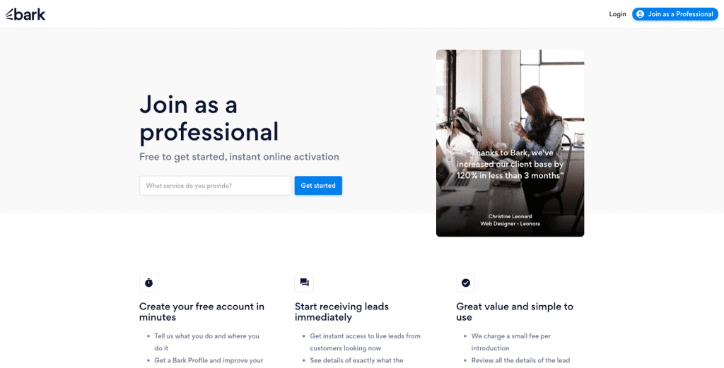
If I created a landing page, this would be my inspiration. Clean, easy to read and driven by massive benefits. All you need.
The three subheaders above the fold tell the visitor exactly why they’ll love the service – it takes seconds to set up, provides instant access to live leads and is great value for money. Which is much more effective and likely to convert than ‘What we do’ and ‘How we can help’. This just tells them.
The bold numbers below highlight the value of using the service, followed by customer success stories to back them up. One of which states Bark has brought in 82% of their clients, which encourages and strengthens trust even further. Specifics like this work extremely well and help to make the statement, brand and website seem more authentic.
4. Able Locksmith
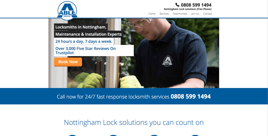
Anyone who’s locked out of their house needs a locksmith ASAP. And anyone reading this landing page knows they can get one. So technically, this one is amazing.
Their phone number is displayed twice above the fold in bigger and bolder text, allowing the customer to get in touch quickly without scrolling through the rest of the page. The bright orange CTA button adds extra impact, while the benefit-driven text shows they’re highly recommended and available 24 hours a day.
Any extra information is clearly displayed under the icons in the centre of the page, assuring the customer there is no call-out charge or hidden costs. There’s also a section dedicated to well-known clients, such as the British Heart Foundation and Hotel Chocolat, with bold icons for each one. (Let’s not forget the ‘free phone’ reference at the top. Love that bit.)
5. Casper
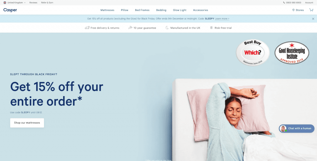
This is probably one of the most in-depth, effective landing pages I’ve ever seen. Straight away you’re inundated with unbeatable benefits worked into a simple design. The 4 benefits at the top are distinct and easy to read and the branded awards and accreditations are impossible to miss.
One small scroll and there are fantastic awards from reputable Real Homes and Architectural Digest, and 1,967 reviews at an average of 4.5 stars. So basically immediate trust.
My favourite though is the carousel of Instagram posts (with the Instagram handle) to show the Casper mattress in real-life living spaces. Being able to see how much other people love the mattress will convince users to buy even more.
6. UK Models
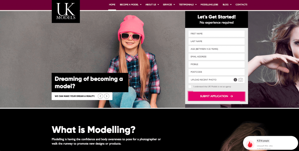
The headline fits perfectly here as most people who want to become a model have always dreamed of being under the spotlight. Placed beside the simple application, customers will feel as if they’re just a few small steps away from walking the runway which makes them more likely to convert.
Though it doesn’t specify any benefits above the fold, anyone who visits the page more than likely just wants to apply and submit their photo. Which means the ‘top 6 reasons why you should choose us’ section is placed perfectly in the centre of the page.
The pop up in the bottom right-hand corner makes people feel as though they must act quickly to land their perfect modelling contract, just like travel websites or Etsy do with ‘6 people have this in their basket right now’. This type of FOMO/urgency pushes potential customers along the buying cycle, cutting their thought-process short and convincing them to take action straight away.
7. Masterclass
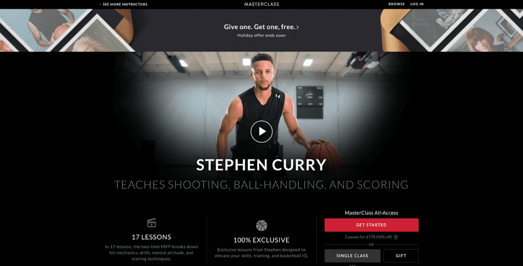
The sleek design of this landing page was what landed it in my top 15. But also the technical aspects that are often hard to find.
Above the fold, there’s an energetic and bold video that sums up the excitement of the masterclass. You see basketball tricks from Stephen Curry himself, watch him play for the Golden State Warriors and hear some of his progression advice, without even having to scroll down the page.
Important benefits are highlighted below, with an entire breakdown of every single lesson. So potential customers know what to expect without even having to ask. Language like ‘Here’s how Stephen shoots when he receives a pass’ also entices people to learn exclusive tricks, rather than something generic like ‘Learn how to shoot well.’ It’s also more promising to be JUST like him, as these are the exact techniques he uses himself.
8. Top 10 Best Paid Surveys
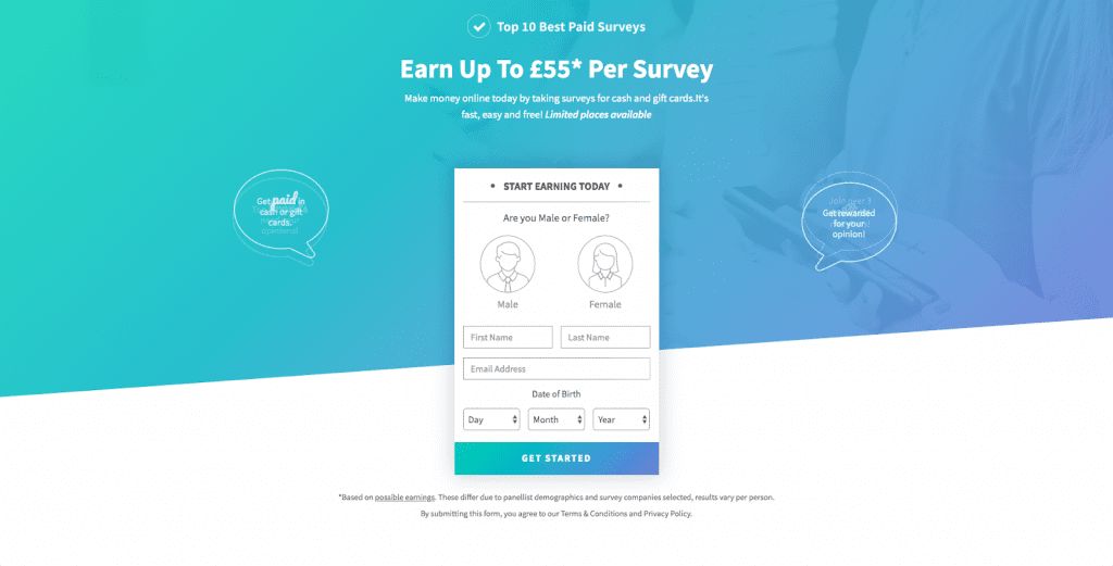
Earning up to £55 (rather than a generic £50+) for filling out a survey sounds amazing, and is the exact reason this landing page will convert. People who want to earn cash will just want to fill out the form. And they can do that so easily here.
The simple step-by-step section makes the process seem even easier than imagined, with the most detail put into the final “Get paid” step. Because that’s all these visitors care about. Money. Especially as the brand icons add intrigue and make the surveys seem worthwhile.
As the design is so simple, there’s a FAQ section at the bottom of the page about how to register, how old you have to be to sign up and the kind of surveys available. An FAQ is designed to answer any questions for users who need a bit of extra trust before signing up for something that seems too good to be true, making it really effective for this page.
9. Plumbing Force
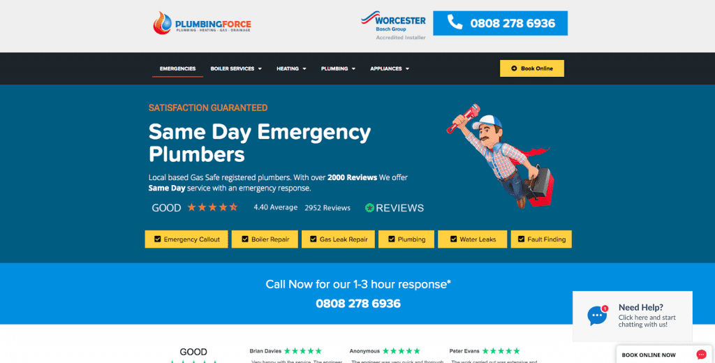
Everything you could possibly want to know is above the fold here. And they even had room to add an image of a plumbing superhero. Genius.
Local, Gas Safe registered emergency plumbers, with 2952 reviews averaging at 4.40, guaranteed satisfaction and six clear services. And, two phone numbers and a bright yellow CTA that’s psychologically proven to gain higher conversions. There’s even the option for a live chat, assuring the customer it’s quick and easy to get in touch while subconsciously persuading them to stay on the page.
The testimonials below also include full names and the dates they were posted, which adds credibility and convinces more people to use the service.
10. Housekeep
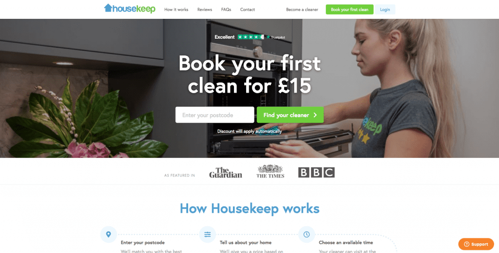
A classic landing page in my opinion but also works extremely well.
Visitors can easily see the discounted price of their first clean, a 4.5-star rating on Trustpilot and that the business has featured in credible magazines, without having to lift a finger. The two colourful CTA’s also entice the reader to click through and find the perfect cleaner for their home.
Further benefits are explained below, with a simple step-by-step graph of how simple and easy it is to book. Images and star ratings for each cleaner show the visitor exactly what to expect – allowing them to do nothing but relax before their sparkly clean.
11. Benjamin The Photographer
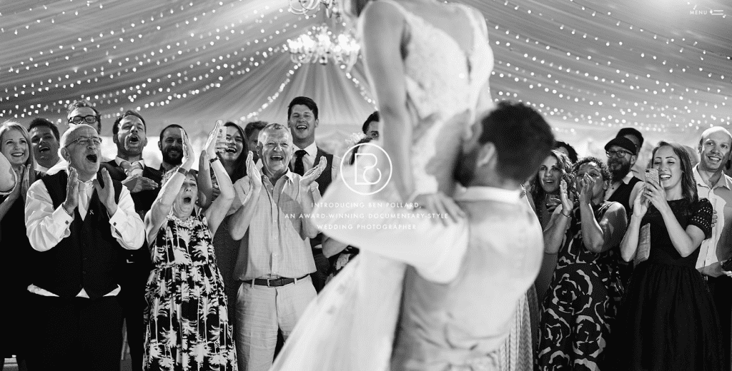
A little different from the rest, but the perfect match for this type of industry. Rather than “Do you want amazing photography?”, a simple, benefit-driven snippet of text tells the visitor everything they need to know. And, the featured image is a carousel of diverse photography. A slight downside though, you can’t read the text on the image shown.
Underneath, 5 key achievements are highlighted in simple icons, with stand-out numbers that add extreme credibility. People are much more likely to believe you’ve won 33 international Weddison awards than 30. The CTA ‘Is my date available?’ is also one of my favourites, and will have a much higher click-through rate than ‘Get in touch.’
I’m not usually a fan of large descriptions either, but I think the one here works. It shows his personality, describes his photography style and helps build a connection.
12. Perlego
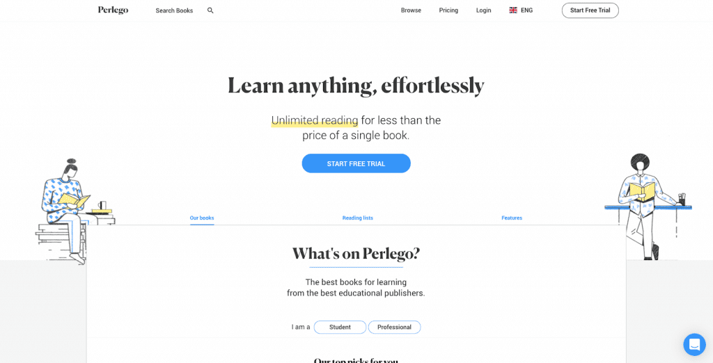
The headline and subhead have got me here. Who doesn’t want to learn anything, effortlessly? And do so for less than the price of a single book?
Speaking of effortless, the simplicity above the fold is amazing. The hint of colour before the design splits into hundreds of colourful books emphasises the text even more, highlighting just how simple the service actually is. The design makes it easy to explore different genres without having to click through to a different page.
Best of all, the entire page appeals to two separate personas (students and professionals) without making it confusing. There is a clear divide between the two, with clear CTA’s for both.
13. Property Cash Buyers
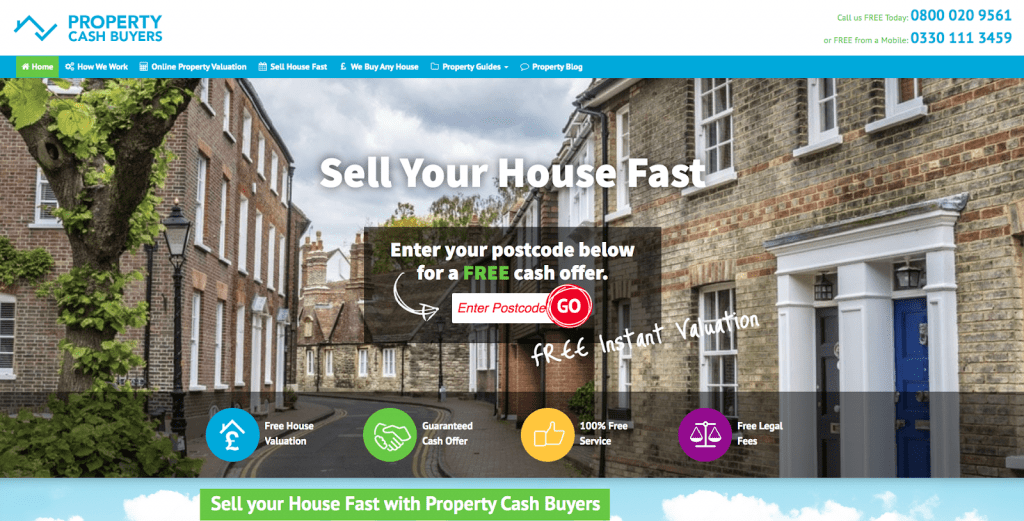
This one reminds me of a sales page you’d see back in the day. But that’s why I love it.
The snappy headline assures visitors they can sell their house as quickly as possible. The use of the arrow directs straight to the bright red ‘GO’ button, which adds to the urgency and makes the service feel fast-paced. Even better, the colourful icons underneath give potential customers peace of mind that they won’t spend more money than they need.
In the centre of the page, the CTA “Take the 60-second Valuation NOW… that’s all the time it takes” adds personalisation and makes people more inclined to click through. Especially since it’s included throughout. You don’t just have to take their word for it either, as the 3 simple steps to selling a house are highlighted below. It’s all quite old-school, but I’m a big fan. Why change what works?
15. Team Bootcamp
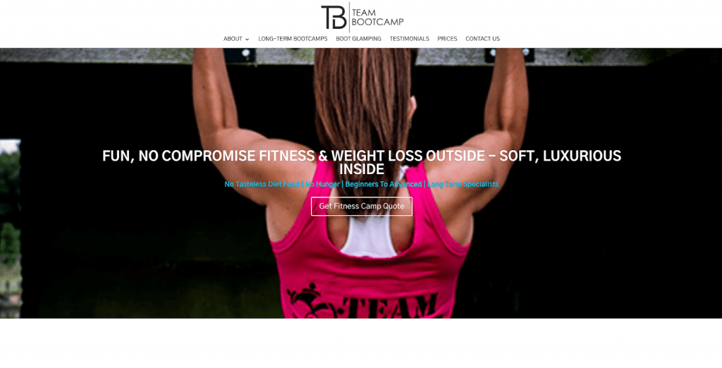
I like this one because of its energetic copy. The nature of the site means customers need to feel encouraged, motivated and like they’re in safe hands, and that’s exactly what it does. It’s quite long, but long landing pages can generate up to 220% more leads than a CTA above the fold.
The interchanging headlines, relatable intro and body copy scream enthusiasm. The use of ‘YOU’ throughout, in sentences like “the focus is purely on YOU.’, assures potential customers they’ll be the core focus of the boot camp. Which means when it comes to losing “up to 12 pounds”, they’re guaranteed amazing results.
Along with the enthusiastic, benefit-driven copy, bold statistics like “24 tonnes of fat scorched” and “lose between 8-14 lbs in a week” makes personal achievements seem even more realistic. Which is bound to encourage higher click-through rates, enquiries and sign-ups.
16. Leadfeeder
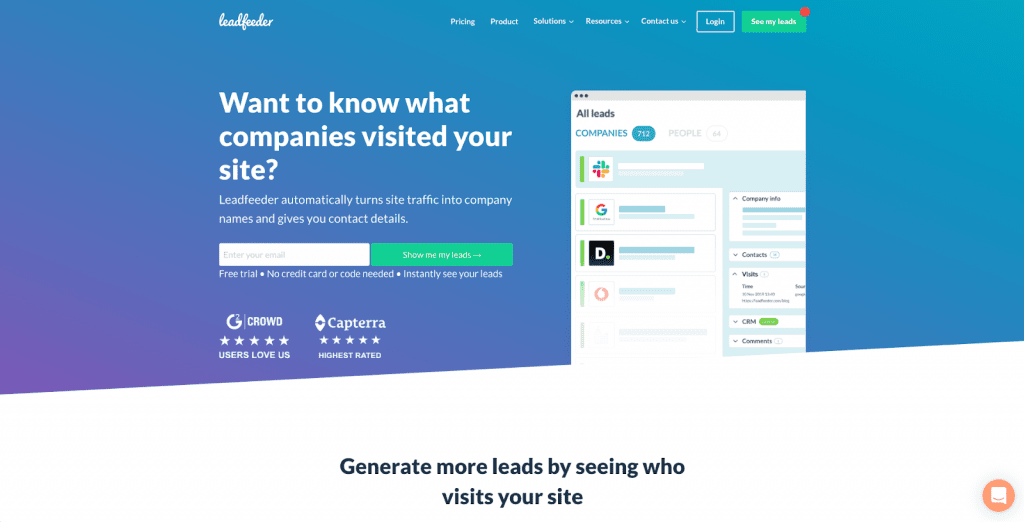
I love the simplicity of this one. Anyone who runs a business wants information about new leads. So instantly getting their contact details without using the business credit card? Even better.
The short snippets of text and a strong focus on the CTA’s emphasises this, with “30-days worth of fresh leads” adding a sense of urgency. The CTA button above the fold has a similar effect and persuades potential customers to enter their email address straight away. Being rated highly by G2 Crowd and Capterra does all the convincing, especially since they suit the industry it’s in.
For those who think it seems too good to be true, stand-out statistics from November 2019 show specific results, with 13.9 million leads for 33,696 B2B customers.
Tools and services to help you optimise
There are also many free and cost-effective resources online that can help you create a successful landing page. Even better, some can be used together to drive excellent results and automate your workload.
Here are some of our favourites:
- Landingi – design and publish your landing pages with their easy landing page design platform. They also offer over 300 templates to choose from, so you will certainly find the right one for your business.
- Unbounce – create and optimize dedicated landing pages that prompt your visitors with one focused goal, instead of leaving them to wander a site full of distractions with Unbounce.
- Simvoly – their drag and drop builder makes creating your landing page quick and easy. They offer hundreds of templates and custom blocks to choose from so there is no need to build the pages yourself, you can pick a design and modify it to whatever suits you.
- Instapage – consisting of six products under one advanced platform, Instapage can help you maximize your conversion rates through creating landing pages, personalization, experimentation, AdMap, collaboration and page speed.
- Wishpond – Wishpond gives you everything you need to help your business excel under one platform, specialising in creating high, converting landing pages with their easy drag-and-drop builder.
Key takeaways
You can learn a lot from the landing pages you find on the internet. But you should always remember the fundamental elements:
- Benefits: Include as many as you can, especially above the fold.
- Trust/reviews: These are essential for turning leads into customers.
- Simplicity: Make sure your page is clear, concise and easy to read.
- Stats: Be specific! 57% is better than “over 50%” and helps to build trust.
With these four guidelines, you’ll be on your way to creating the best landing pages for your business needs.