If you’re familiar with searches like these:
- ‘Do I need a website or just a landing page?’
- ‘Is a landing page part of your website?’
- ‘What is a website landing page?’
Then you’re in the right place.
The only difference is, we aren’t just going to answer those questions. We’re going to tell you exactly how you can create a high-converting page that stands alone from your website.
Our tips won’t just help you boost your traffic, but will make sure you’re targeting the right people, with the right content, at the right time. It’s all about convincing them to take action, which we explain in detail throughout this article.
The browser and the buyer
There is a major difference between the people who visit your website and the people who click through to your landing page – one comes to browse and one comes with something specific in mind. The intent is different.
For instance, if you use PPC advertising, someone might find your website on Google when they’re looking for a product or service. At this stage, they would be aware that your brand exists and probably want more information.
However, they won’t be convinced just yet. Since they’ve found your website by chance and clicked on it to browse, they’re only in the first and second stages of the consumer buying process.
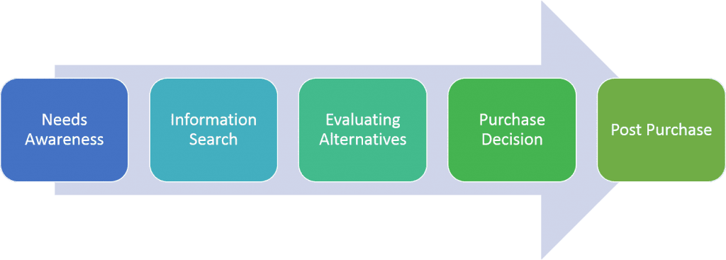
On the other hand, your landing page visitors are much further along this cycle. They have already shown interest by actively clicking through to your landing page, most likely from one of your CTA buttons telling them to ‘find out more’.
They are convinced your business can help them, and they are already deciding whether to make a purchase. You can even follow these 6 best practices for landing pages to make them convert.
But that’s not all.
Your landing page needs to have a specific purpose or function for it to work. It can’t just be better, bolder, or more colourful than your website, it needs to push the particular product or service you are offering. It’s like taking part of your website and putting it under a microscope.
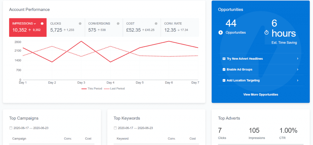
Here is one of our landing pages at Adzooma, based around PPC optimisation
Every user who has clicked through to that page is looking to improve their website, and all our landing page needs to do is make them want our offer.

Sounds easy right?
Well, here are the 4 best practices we use on all of our landing pages. If you want to speed up the process, the Adzooma platform can alert you of suggested improvements to help increase your conversions.
For example, if you’re running several landing pages and don’t have time to check the loading speed of each one, Adzooma will let you know if there are any problems. It saves you the time and effort of analysing every single page – freeing up time to knuckle down on these important elements.
4 best practices to increase your conversions
1. Make your site ultra-specific
Your landing page needs to have an objective.
The whole point in creating one is to reach a particular goal, so it’s best to start from fresh if you’re trying to sell your entire inventory. Focusing on a certain product, service or campaign will convert visitors faster as there is much less choice.
Plus, according to HubSpot, companies get 55% more leads when they increase their number of landing pages from 10 to 15.
If you’re worried you’ve stripped it back too much, you can monitor your landing page performance in our platform and make small changes as you go. It’s the easiest way of getting great results.
Want to push your furniture upholstery? Use that keyword in your headline and highlight your impressive experience in that area. Showcase captivating before and after pictures of your work, tuning in to the finer details customers will love.
Above all, avoid making your landing page your homepage. It’s a common pitfall of many businesses, but one you definitely want to avoid.
2. Use killer CTAs
Landing pages are designed to convert users, so they need to be action-orientated. This means big and bold CTAs.
Depending on your business, your CTA’s could be based around anything from getting more sales, hitting more Ebook downloads, or increasing your number of enquiries. If you want to really ramp it up, you can use benefit-driven text that’s personalised to your product or service.
For example:

Balance Meals, a bespoke meal prep company offering personalised plans.

Weight loss program BellaBeat, designed to help women reach their fitness goals.

Creative Asset, a web design company specialising in ‘future-proof’ websites.
Use these examples as inspiration to create your own CTAs, and remember…
If adding CTAs to your Facebook page can increase your click-through rate by 285%, your landing page can’t afford to be without them. If you take one thing from this article, let it be that.
3. Include a captivating form
If you’ve got a form on your website, the biggest mistake you can make is copying and pasting it over. It might save you time, but no one will use it.
Why? Because most website forms are made for general enquiries. And in this case, general enquiries don’t convert. You want to make your visitors feel like your business is doing something for them, that they aren’t just giving away their details for nothing.
If you can make them feel like they’re getting more out of it than you are, it’s a win-win.
To do this, you need to make sure your form is there for a reason, and that reason is obvious to your users. It’s all about balance – you don’t want people creating random accounts for the sake of it, but engaging forms, such as pop-ups, have been known to achieve 1,375% more sign-ups. Do your research first.
In addition, make your form as short and snappy as you possibly can. If you want to capture emails to use for retargeting, don’t even think about asking for their age or home address. These are the small elements people begrudge on websites, and the easier it is to fill out, the more emails you will get.
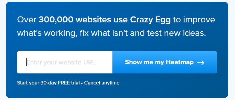
See Crazy Egg’s for inspiration:
4. Hammer down on relevant testimonials
92% of customers read reviews before buying, and 88% of consumers trust online testimonials and reviews as much as recommendations from friends or family. It’s such a big number that it does all the talking for us.
Don’t get us wrong, positive testimonials on your website can drive more sales. But if you’re offering a 50% discount on handmade anniversary gifts, your visitors want to know more about that than your colourful embroidery.
For example, which testimonial do you think has the most impact?
- “Great customer service, really friendly and fast delivery. Will definitely buy again”.
- “The thought and care put into my gift is one in a million. It’s exactly what I envisioned gifting my partner and have never received a personalised item with such stunning details. Beautifully packaged too!”
Of course, it’s number two.
They are both impressive, but the edge of the second one fills you with hope and excitement for your own special order.
Landing page builder tools
There are a load of tools that you can use to create landing pages that convert. Here are some of our favourite platforms:
Ready for more customers?
Go ahead and use our tips, tricks, and 3 best practices to create a high-converting landing page that works alongside your website. Keep your audiences in mind and remember their intentions, and you should see conversions in no time.
For a little bit of inspo, here are 15 of the most inspiring landing pages.